Visualizing Math: A Guide to Creating Times Table Animations with Python
Explore the mesmerizing patterns of times tables with Python! In this blog post, we present an alternative implementation to the famous Mathologer's video where beautiful patterns emerge from times tables. Burkard highlights how stunning patterns arise from these tables and utilizes Wolfram Mathematica to demonstrate these patterns in greater detail. This blog post aims to showcase a similar implementation using Python.
For those unfamiliar with the concept, it is recommended to view the video that served as inspiration for this post. It provides a comprehensive explanation of what Times Tables are.
This post provides an alternative approach to generate similar animations to the ones seen in the video, using Python and its libraries such as Matplotlib and IPython.
The following animations were created using Python and its supporting libraries.
Bringing this captivating video to life with Python is made easy with the help of a Jupyter Notebook. Explore the examples and discover the beauty of Times Tables for yourself by following along. With all the necessary dependencies already installed, the Jupyter Notebook is the perfect platform for experimentation and hands-on learning
In this post, multiple examples are provided, including:
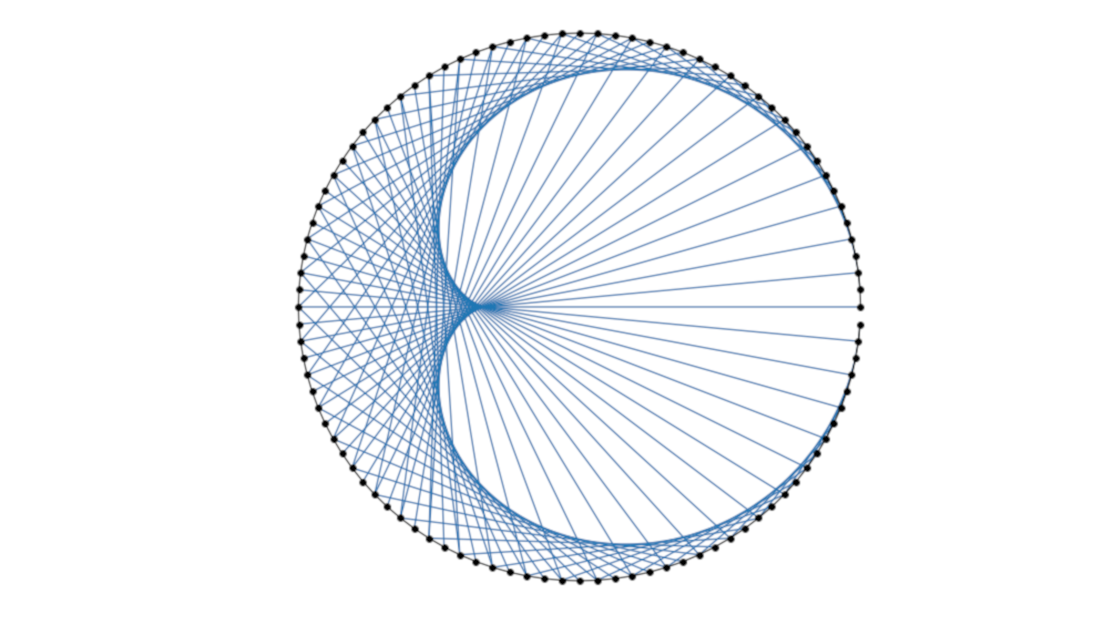
- A static version, as shown above An interactive, parametric version where you can experiment by adjusting values with sliders
- An animated construction, line by line, where the factor and number of points remain fixed, but each line is plotted one at a time
- An animated construction, point by point, where the factor and lines are fixed, but the number of points increases with each frame
-
An animated construction, factor by factor, where the lines and number of points remain fixed, but the factor increases, first in monochrome and then with a rainbow effect.n with the rainbow effect seen in the video.
Note: It's important to note that after exploring each scenario, both an interactive and a static representation of the code will be provided. The interactive version is built using Jupyter widgets, allowing you to adjust parameters and see the results in real-time. However, this also means that each time the sliders are moved, the full animation needs to be re-calculated, so some patience is required. On the other hand, the static representation is optimized for faster display and can be useful for low-speed connections. It should be noted that the static representation cannot be adjusted or experimented with.
Requirements:
- Jupyter: Notebook Interface
- Numpy: For array manipulation
- Matplotlib: For visualization and animation
- ffmpeg (Optional): For exporting the animation
In order to produce these images and animations, the code should be split in 4 parts:
- Import all the necesary libraris
- Define all the auxiliary functions
- Plot the animations
- Export (optional)
Initialization
It is recommended to place all imports at the beginning of the document for better organization and maintenance. This also helps to clearly identify the required tools. In this instance, there are both general purpose imports and those specific to Jupyter. To utilize the code outside of Jupyter, it may need to be modified to remove Jupyter-specific components. This ensures the code can run as a standalone script.
# General Purpose
import colorsys
from typing import Optional, List

from matplotlib import animation, rc
from matplotlib import pyplot as plt
from matplotlib.collections import LineCollection
from matplotlib.lines import Line2D
import numpy as np
import numpy.typing as npt

# Jupyter Specifics
from ipywidgets.widgets import interact, IntSlider, FloatSlider, Layout

%matplotlib inline
rc('animation', html='html5')
Basic Functions
With all the necessary imports in place, it's time to define a few functions that will bring this project to life. These functions include:
- A function to calculate the points around a circle
- A function to generate each of the lines
- A function to plot the labels and points on the circle
- A function to plot the lines on the circle
The first function, named points_around_circle, uses polar coordinates to
determine a specified number of points around a circle of radius 1. The use of
numpy in this calculation enhances its performance.
def points_around_circle(number: int = 100) -> npt.NDArray[np.float64]:
    theta = np.linspace(0, 2 * np.pi, number, endpoint=False)
    xs, ys = np.cos(theta), np.sin(theta)
    return np.stack((xs, ys))
The second function pertains to the generation of lines. Given a list of points, this function generates a new line.
def generate_lines_from_points(
    points: npt.NDArray[np.float64], factor: float
) -> npt.NDArray[np.float64]:
    _, size = points.shape
    index = (np.arange(size) * factor) % size

    line_starts = points.T
    line_ends = line_starts[index.astype(int)]

    return np.stack((line_ends, line_starts), axis=1)
However, the line in numpy format is not directly plotable. To translate the
numpy array into a data structure compatible with matplotlib, a LineCollection
is used. The function generate_line_collection not only generates the line
collection, but also specifies the color based on the HSV format. This
capability will come in handy when creating the final animation.
def generate_line_collection(
    points: npt.NDArray[np.float64], factor: float, color: Optional[float] = None
) -> LineCollection:
    lines = generate_lines_from_points(points, factor)
    color_ = colorsys.hsv_to_rgb(color, 1.0, 0.8) if color else None
    return LineCollection(lines, color=color_)
Static Version
With all the required functions defined, plotting a static version of the data is straightforward. Simply generate the axis object and call the functions in the appropriate order, and the image will be generated. This approach is useful for quickly experimenting with a fixed number of factors and points.
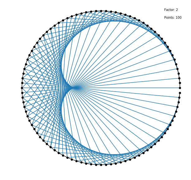
def plot_static(factor: float, number_of_points: int) -> None:
    points = points_around_circle(number=number_of_points)
    lines = generate_line_collection(points, factor)

    plt.figure(figsize=(10, 10))
    ax = plt.gca()
    ax.axis("off")
    ax.annotate(f"Points: {number_of_points}", (0.8, 0.9))
    ax.annotate(f"Factor: {factor}", (0.8, 1))
    ax.plot(*points, "-ko", markevery=1)
    ax.add_collection(lines)

factor = 2
points = 100
plot_static(factor, points)
Parametric Version
One method to update the factor and points variables is to manually change them and re-execute the cell or function. However, Jupyter offers support for interaction, allowing for a more user-friendly approach via Sliders, a built-in user interface of IPython. The function plot_parametric serves the same purpose as plot_static, with the addition of a call to plt.show() at the end to display the image. While the image is still static, the user can adjust the variables by moving the sliders.
def plot_parametric(factor: float = 2, points: int = 100) -> None:
    points = points_around_circle(number=points)
    lines = generate_line_collection(points, factor)

    plt.figure(figsize=(10, 10))
    ax = plt.gca()
    ax.axis("off")
    ax.plot(*points, "-ko", markevery=1)
    ax.add_collection(lines)
    plt.show()


factors = [21, 29, 33, 34, 49, 51, 66, 67, 73, 76, 79, 80, 86, 91, 99]
print("Try these Factors with different number of points:", *factors)

interact(
    plot_parametric,
    factor=FloatSlider(min=0, max=100, step=0.1, value=2, layout=Layout(width="99%")),
    points=IntSlider(min=0, max=300, step=25, value=100, layout=Layout(width="99%")),
)
Animate Construction Line by Line
In the next step, the focus shifts to animations. In this particular animation, the factor and the number of points remain constant while the lines change. This animation replicates the act of drawing these times tables by hand and provides a deeper understanding of the sequence in which the lines are plotted, instead of simply presenting them all together.
In Matplotlib, animations are constructed using the animate function, which
returns the objects to be displayed in each frame. As a result, two functions
need to be defined in this and the following animations. The first is for the
animate API of Matplotlib and the second is to be integrated into the interact
function of IPython. In this particular case, the function line_by_line takes a
given factor, a specified number of max_points, and an interval. The first
two parameters are already familiar from previous functions, while interval
represents the delay between frames in milliseconds. This delay is directly
related to the animation's frames per second (FPS), which is calculated as FPS =
1000 / delay.
def animate_line_by_line(
    i: int, lines: npt.NDArray[np.float64], ax: plt.Axes
) -> List[Line2D]:
    start_point, end_point = lines[i].T
    line = Line2D(start_point, end_point)
    ax.add_line(line)
    return []


def line_by_line(
    factor: float, max_points: int, interval: int
) -> animation.FuncAnimation:
    points = points_around_circle(number=max_points)
    lines = generate_lines_from_points(points, factor)

    fig = plt.figure(figsize=(10, 10))
    ax = plt.gca()
    ax.axis("off")
    ax.annotate(f"Factor: {factor}", (0.8, 1))
    ax.annotate(f"Interval: {interval}", (0.8, 0.8))
    ax.annotate(f"Points: {max_points}", (0.8, 0.9))
    ax.plot(*points, "-ko", markevery=1)
    anim = animation.FuncAnimation(
        fig,
        animate_line_by_line,
        frames=max_points - 2,
        interval=interval,
        blit=True,
        fargs=(lines, ax),
    )
    plt.close()

    return anim


interact(
    line_by_line,
    factor=FloatSlider(min=0, max=100, step=0.1, value=2, layout=Layout(width="99%")),
    max_points=IntSlider(min=1, max=200, step=1, value=100, layout=Layout(width="99%")),
    interval=IntSlider(min=5, max=500, step=5, value=75, layout=Layout(width="99%")),
)
Animate Construction Point by Point
The next animation focuses on the process of how the figure becomes clearer as
the number of points increases. The factor is fixed, and all lines are plotted
at once, but with each frame, the number of points increases incrementally from
0 to a specified maximum number of max_points. This perspective provides a
different view on the relationship between the number of points and the clarity
of the figure.
def animate_point_by_point(
    i: int, ax: plt.Axes, factor: float, interval: int, max_points: int
) -> List[Line2D]:
    points = points_around_circle(number=i + 1)
    lines = generate_line_collection(points, factor)

    ax.cla()
    ax.axis("off")
    ax.set_ylim(-1.2, 1.2)
    ax.set_xlim(-1.2, 1.2)
    ax.annotate(f"Interval: {interval}", (0.8, 0.8))
    ax.annotate(f"Points: {max_points}", (0.8, 0.9))
    ax.annotate(f"Factor: {factor}", (0.8, 1))
    ax.plot(*points, "-ko", markevery=1)
    ax.add_collection(lines)
    return []


def point_by_point(
    factor: float, interval: int, max_points: int
) -> animation.FuncAnimation:
    fig = plt.figure(figsize=(10, 10))
    ax = plt.gca()
    anim = animation.FuncAnimation(
        fig,
        animate_point_by_point,
        frames=max_points,
        interval=interval,
        blit=True,
        fargs=(ax, factor, interval, max_points),
    )
    plt.close()

    return anim


interact(
    point_by_point,
    factor=FloatSlider(min=0, max=100, step=0.1, value=2, layout=Layout(width="99%")),
    max_points=IntSlider(min=1, max=200, step=1, value=75, layout=Layout(width="99%")),
    interval=IntSlider(min=100, max=500, step=1, value=200, layout=Layout(width="99%")),
)
Animate Construction Factor by Factor
The animation displays the effect of incrementing the factor, with the number of points fixed and all lines plotted at once. To enhance the visual impact, the factor is increased in increments of 0.1 instead of 1. This results in a smoother animation. This version is monochromatic, with all lines appearing in the same color.
def animate_factor_by_factor(
    i: int, ax: plt.Axes, max_points: int, interval: int
) -> List[Line2D]:
    points = points_around_circle(number=max_points)
    lines = generate_line_collection(points, i / 10)

    ax.cla()
    ax.axis("off")
    ax.set_ylim(-1.2, 1.2)
    ax.set_xlim(-1.2, 1.2)
    ax.annotate(f"Interval: {interval}", (0.8, 0.8))
    ax.annotate(f"Points: {max_points}", (0.8, 0.9))
    ax.annotate(f"Factor: {factor}", (0.8, 1))
    ax.plot(*points, "-ko", markevery=1)
    ax.add_collection(lines)
    return []


def factor_by_factor(
    factor: float, interval: int, max_points: int
) -> animation.FuncAnimation:
    fig = plt.figure(figsize=(10, 10))
    ax = plt.gca()

    frames = int(factor * 10)
    anim = animation.FuncAnimation(
        fig,
        animate_factor_by_factor,
        frames=frames,
        interval=interval,
        blit=True,
        fargs=(ax, max_points, interval),
    )

    plt.close()

    return anim


interact(
    factor_by_factor,
    factor=FloatSlider(min=0, max=100, step=0.1, value=5, layout=Layout(width="99%")),
    max_points=IntSlider(min=1, max=200, step=1, value=100, layout=Layout(width="99%")),
    interval=IntSlider(min=50, max=500, step=25, value=100, layout=Layout(width="99%")),
)
Animate Construction Factor by Factor with Color
The final animation is similar to the previous one, with the difference being
the addition of color. To achieve this, the function
animate_factor_by_factor_colored is passed an additional parameter, frames,
which specifies the total number of frames. The HSV color system is utilized,
with fixed saturation and value, while the hue changes from 0 to 1 as the
current frame (i) is divided by the total number of frames (frames),
resulting in a range from 0 to 1.
def animate_factor_by_factor_colored(
    i: int, ax: plt.Axes, max_points: int, interval: int, frames: int
) -> List[Line2D]:
    points = points_around_circle(number=max_points)
    lines = generate_line_collection(points, i / 10, color=i / frames)

    ax.cla()
    ax.axis("off")
    ax.annotate(f"Interval: {interval}", (0.8, 0.8))
    ax.annotate(f"Points: {max_points}", (0.8, 0.9))
    ax.annotate(f"Factor: {factor}", (0.8, 1))
    ax.plot(*points, "-ko", markevery=1)
    ax.add_collection(lines)
    return []


def factor_by_factor_colored(
    factor: float, interval: int, max_points: int
) -> animation.FuncAnimation:
    fig = plt.figure(figsize=(10, 10))
    ax = plt.gca()

    frames = int(factor * 10)
    anim = animation.FuncAnimation(
        fig,
        animate_factor_by_factor_colored,
        frames=frames,
        interval=interval,
        blit=True,
        fargs=(ax, max_points, interval, frames),
    )

    plt.close()

    return anim


interact(
    factor_by_factor_colored,
    factor=FloatSlider(min=0, max=100, step=0.1, value=5, layout=Layout(width="99%")),
    max_points=IntSlider(min=1, max=200, step=1, value=100, layout=Layout(width="99%")),
    interval=IntSlider(min=50, max=500, step=25, value=100, layout=Layout(width="99%")),
)
Export
The generated animations can be exported as mp4 files by calling the appropriate
function, storing the result in a variable and using the following code snippet.
The function specific_function should be replaced with the desired animation,
such as factor_by_factor_colored or animate_point_by_point, and the
corresponding parameters should be included.
anim = specific_function(*args)
filename = "my_animation.mp4"

Writer = animation.writers['ffmpeg']
writer = Writer(fps=30)

anim.save(filename, writer=writer)